|
Let me return to the Australian outbreak today - for now, at least, the daily case numbers have not begun to leap upwards. If this trend continues, and Australia begins to follow a track that looks more like Norway than Belgium, this will clearly be a very good thing. The full impact of the self-imposed cruise ship super-cluster remain to be seen however. Click the image for our full update.
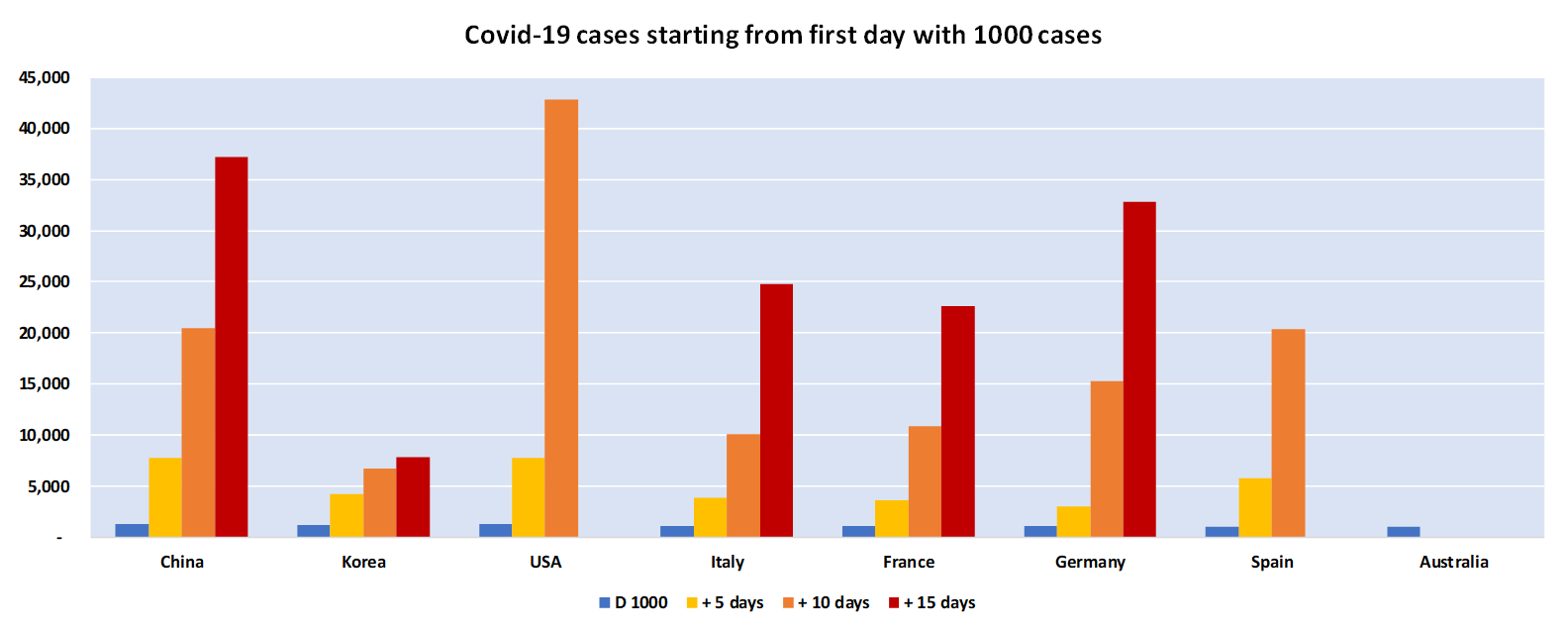
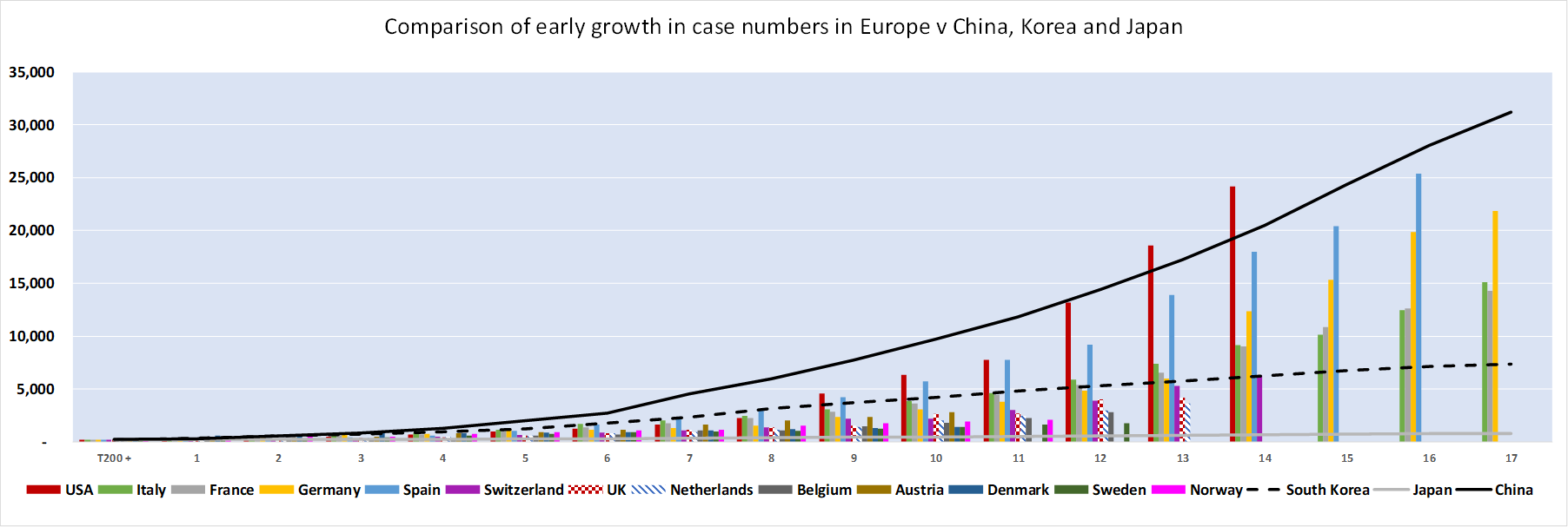
Not much good news in today's figures - other than that they are tracking much as expected. The US outbreak now has more than triple the number of cases as China at a comparable point (measured by number of days after reaching 1,000 cases. It is adding new cases at a rate of over 20,000 a day (averaging over the last few days). In comparison, at this point in China new case numbers had halved from the peak - ie the rate of new cases in the USA is now more than ten times the rate in the Chinese outbreak (ie the slope shown by the red bars is over 10x the slope of the black line below.
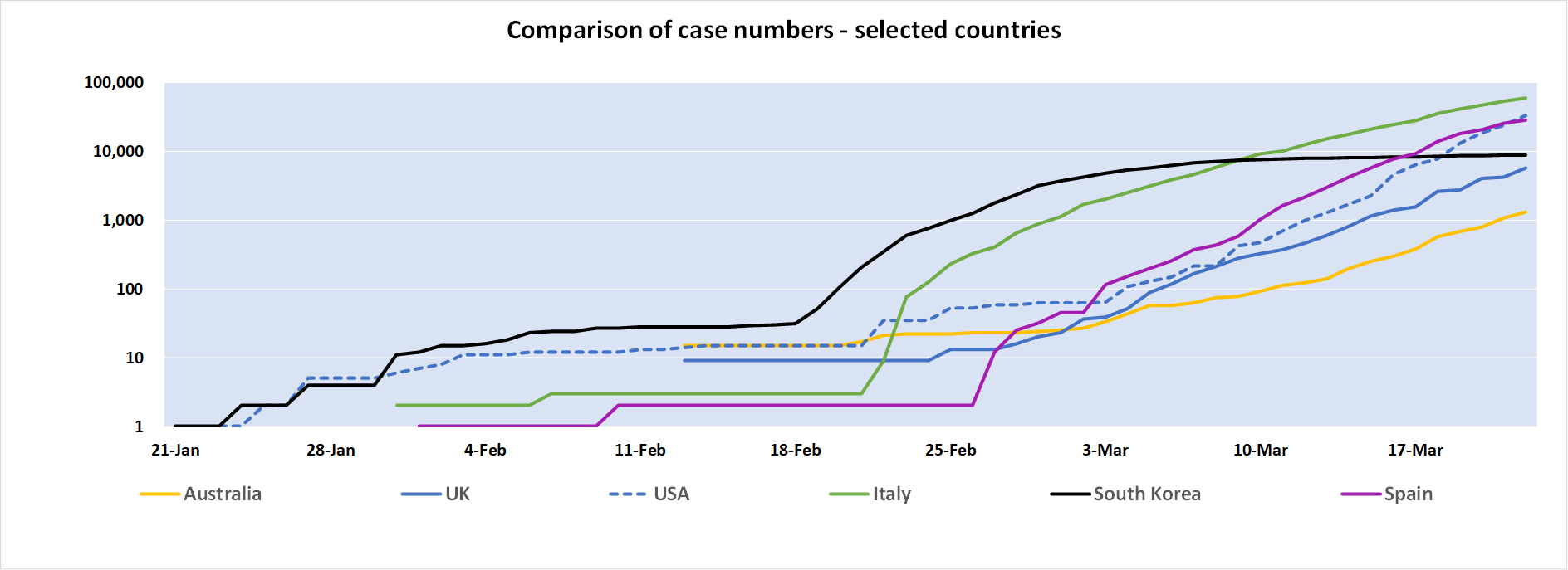
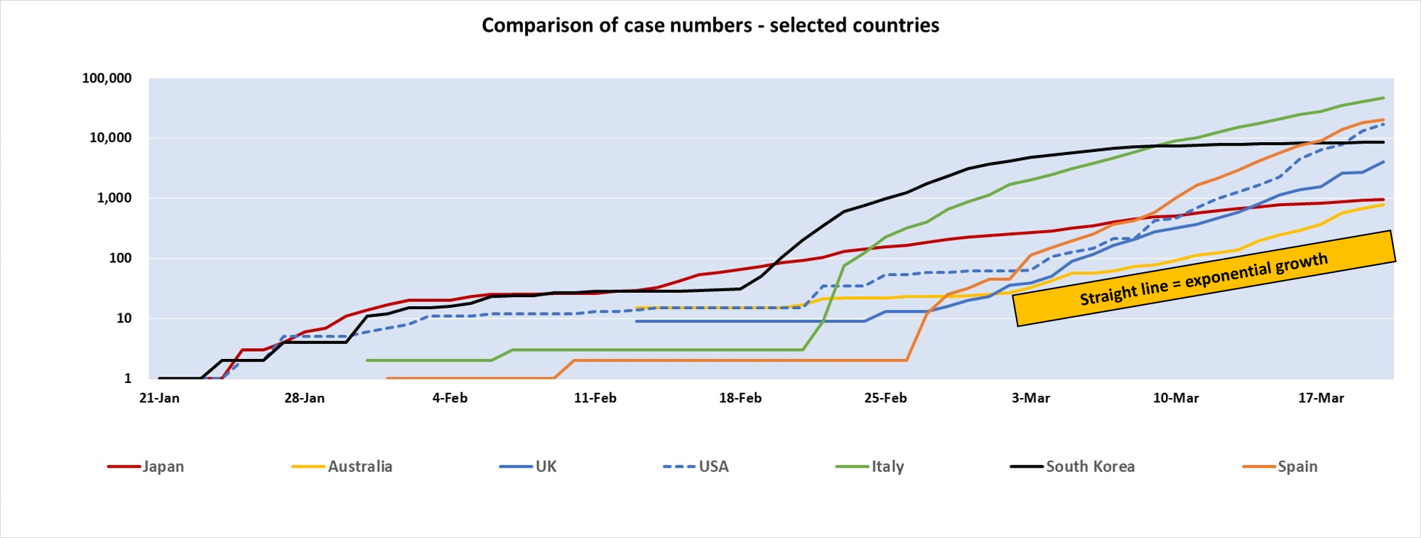
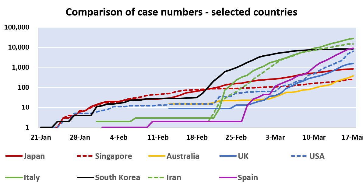
Click the chart for our full summary. There has been some comment that Australia has been successful in beginning to 'flatten the curve', ie slow the rate of growth. On the log chart below, a straight line implies exponential growth - ie reducing growth will show up as a line that is becoming less steep. There is some sign of this in the numbers, but the cruise-liner farrago last week does not augur well for what lies ahead. Thus we remain very cautious. Meanwhile, for those arguing that the current lock-downs may not be worth it, please pay attention to what is happening in New York, Spain and Italy, amongst others. All have case numbers that continue to escalate rapidly, placing a huge burden on health systems. Many tragedies lie ahead.
For our full summary, please click here. I'm back in NYC - there were more controls to leave Australia (as Australians have been banned from travelling other than in certain circumstances - for me, returning to my home in the USA) than the USA (actually, there were no border controls at all beyond the usual visa check).
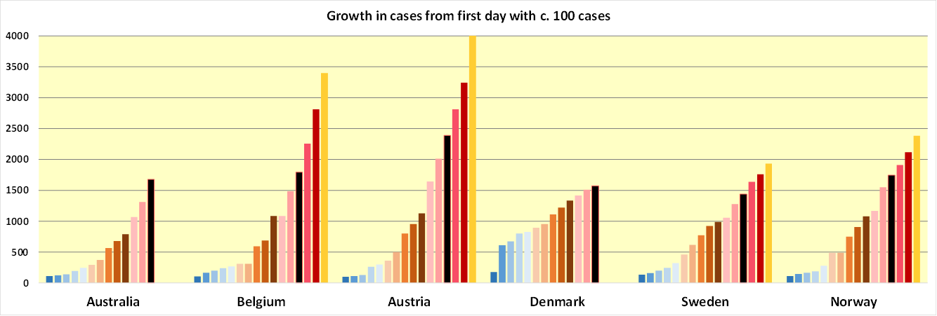
Let me focus today on Australia, where debate continues as to whether to lock everything down, or give up at an early stage "because of the economy". The latter is a terrible misconception - it is hard to believe our economy will thrive if we allow several percent of the population to die. I would like anyone who advocates for this to explain how we will choose who is turned away from hospitals, and where we should put the bodies. In New York right now, they're being stored in freezer trucks, as the morgues are already full. Turning back to rational arguments, look at the chart below. This shows case numbers from the first day with over 200 cases - Australia is at day, shown in black below. Note that our outbreak has tracked that seen in Belgium quite closely. If we continue to do so, case numbers will double in another five or six days. For our full update, click this link. Posting a little later than usual today, but case numbers are still taken at around the same time (10am Sydney time) from Johns Hopkins. As an illustration of why early lockdowns make a difference, compare the course of the outbreak from the first day with over 1000 cases in five day periods.
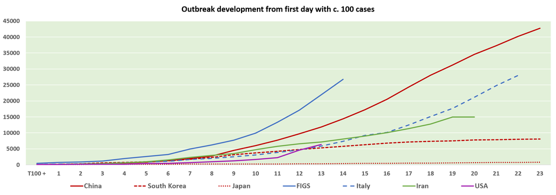
For a full summary, click this link.  Australia is about to see an explosion in case numbers - it is, sadly, a textbook case of the dangers of a slow response to COVID-19. Flip, flop, flap is not effective. The chart below shows case numbers from the first day with >100 cases for a handful of countries. Australia continues to track Belgium and with a lockdown only just beginning to be introduced, ongoing exponential growth is likely - expect case numbers roughly to triple in the next week. Meanwhile lockdowns are having a positive impact in other countries - see our full summary here. The chart below shows clearly the benefits of a lockdown accompanied by extensive testing and tracing (Korea - black line). A delayed and initially less stringent response (to a more widespread outbreak) in Italy is working, but more slowly, as it is beginning to do in Spain.
Delays in responding to the crisis in the USA mean exponential case growth is continuing. In Australia, lower original transmission has now increased (ie the yellow line has become steeper). Continued prevarication, confusion and delay have likely sown the seeds of a much larger outbreak. Download the full summary here. 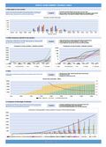 The latest figures should make for bracing reading for any politican who has not realised how critical it is to implement a lockdown early. First, look at how rapidly case numbers have increased in the USA and Europe - Spain is now tracking China's outbreak, and the USA looks to be on a materially worse track. NB this chart only shows the first 17 days after case numbers reached 100 in each country - Italy is now at over 50,000 cases. Click the image above for the full summary. Second, remember how long it has taken countries to move from 100 cases to 1000 cases:
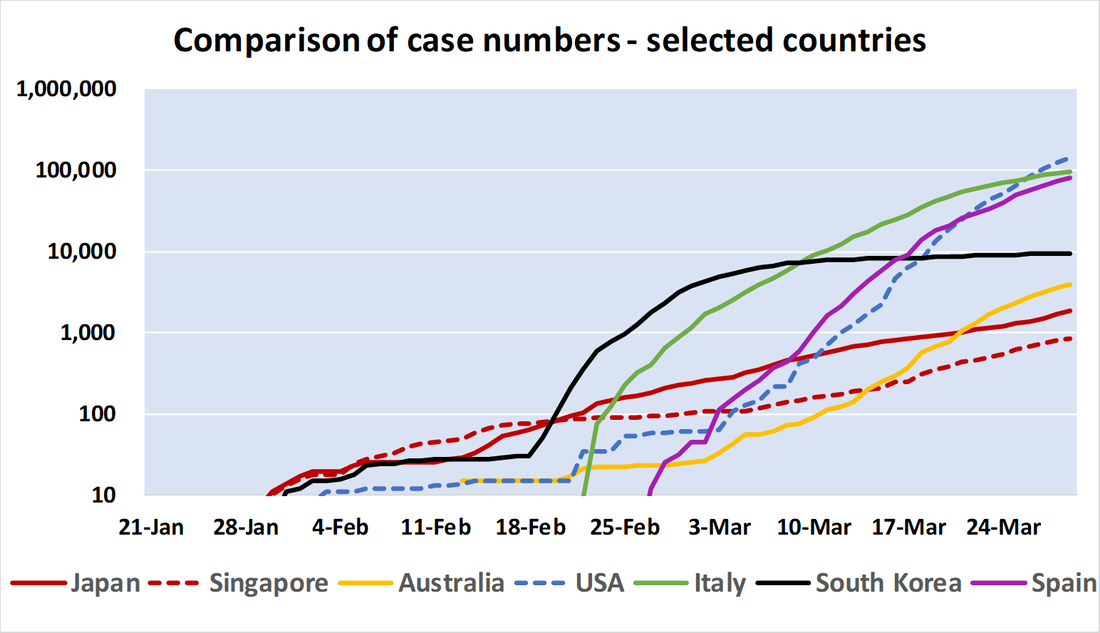
You know the rest... 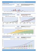 Mostly more of the same in the data overnight. Outbreaks across Europe and US expanding rapidly, whilst politicians scrabble to catch up. Lock down hard and lock down early is the right response, but few have grasped this nettle. In Australia, ambivalence on measures and foolish complacency by some in government has contributed to an accelerating growth rate, as shown below. This is a log scale chart, so a straight line = exponential growth. If the slope of the line increases, then the growth rate is increasing. Stay home, keep your kids out of school. The policy will catch up pretty quickly. Click the image above for a more detailed analysis. Much more bad news than good news in today's figures. Full summary available from this link.
|
Categories
All
Free resources to support you and your team as we work together to mitigate the impact of corona virus - please feel free to share! |
|
We pay respect to Traditional Custodians and First Nations peoples everywhere, including the Gadigal People of the Eora Nation and the Lenape
|


