
|
The chart below shows how the outbreak has developed in various countries, starting from the first day with 100 or more cases. Click the image for further detail including a longer time series. 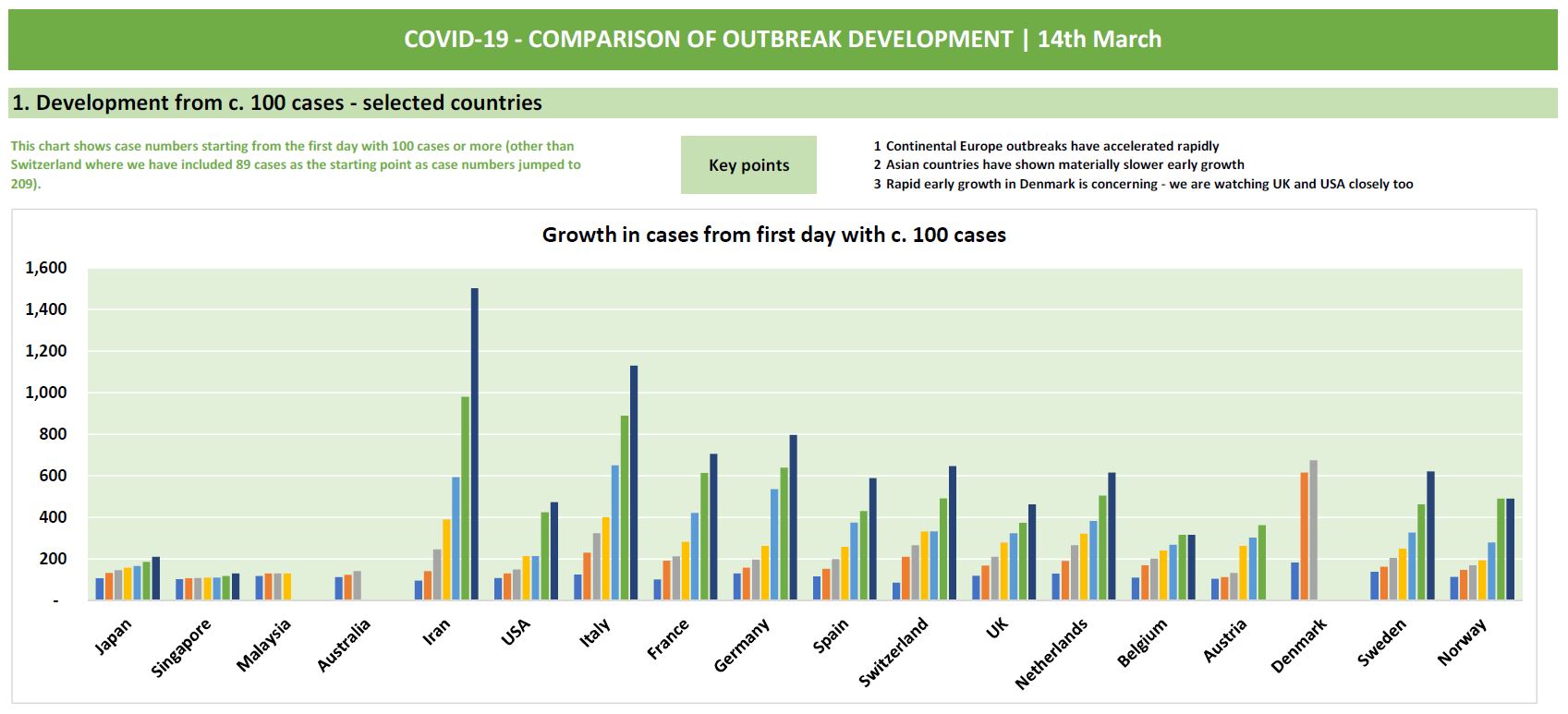
|
|
We pay respect to Traditional Custodians and First Nations peoples everywhere, including the Gadigal People of the Eora Nation and the Lenape
|