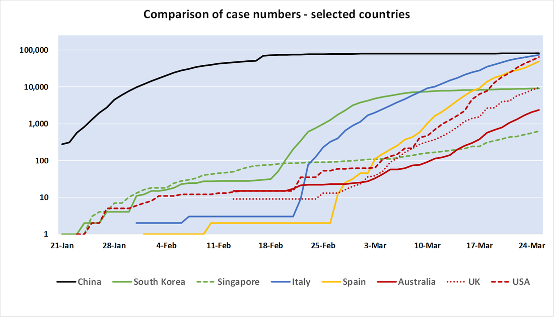
 Got a strong coffee in hand? Then look at this. NB it's a log scale chart. The upper edge of the scale is 250,000 cases... Black + Green = strong lockdown Blue = slower, more limited lockdown, followed by hard lockdown Yellow = even slower lockdown Red = no lockdown. Full update available from this link. Comments are closed.
|
Categories
All
Free resources to support you and your team as we work together to mitigate the impact of corona virus - please feel free to share! |
|
We pay respect to Traditional Custodians and First Nations peoples everywhere, including the Gadigal People of the Eora Nation and the Lenape
|

